How simple is it to edit colours? Let a girl’s dreamy palette tell you


“Sometimes when you see beautiful pictures online or in magazines, you must feel that its effect is only achieved through a complex series of edits. But actually, editing ain’t so hard, by simply tweaking the tint of a photo, you can completely change its style. This article is here to teach you how to quickly find your own dreamy look palette.”


What will be shared today are tips to adjust the tint of a photo in one click! Most wedding photos with the dreamy edit are done using this method.

Aside from this, the dreamy tint you see in some short films, MVs or commercials that look unrealistic yet beautiful… are more or less all edited through adjusting the tint.

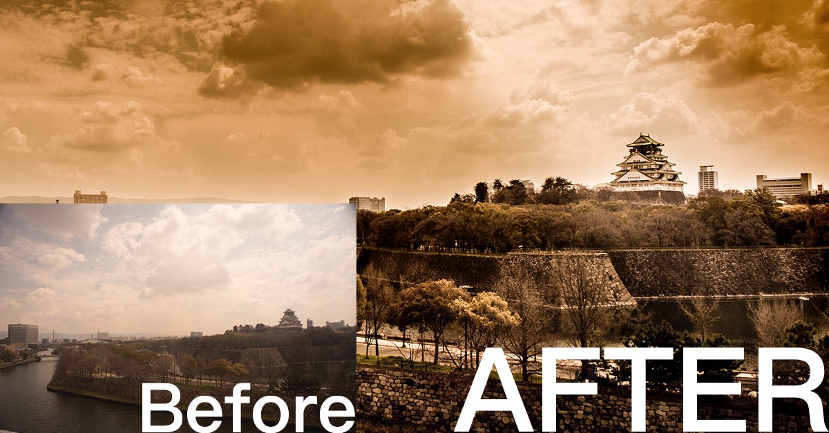
A photo like this, if shot using a phone, can be edited with these effects using built-in filters. But if you don’t like the options given by the filters, and want to find your own style, then as long as you understand tone splitting, you will be able to perform magic on your own photos!


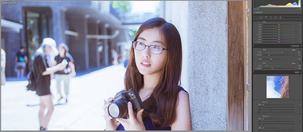
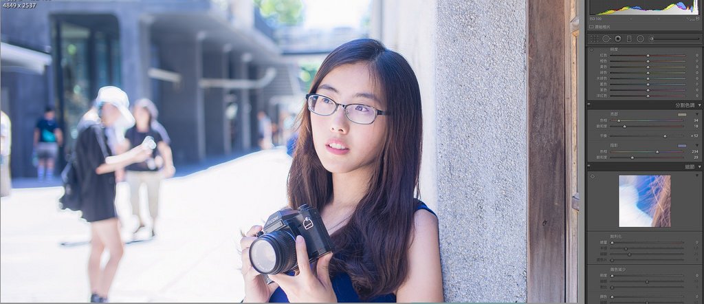
The above is a portrait I shot, when unedited, the colours just look natural and light, without any special style or atmosphere. After loading the photo in Lightroom, find “split toning” in the right-hand column, adjust the values, and observe the magic!


Split toning is divided into highlights and shadows, affecting the brighter and darker bits of the photos respectively. And according to your commands, it will change the tint!

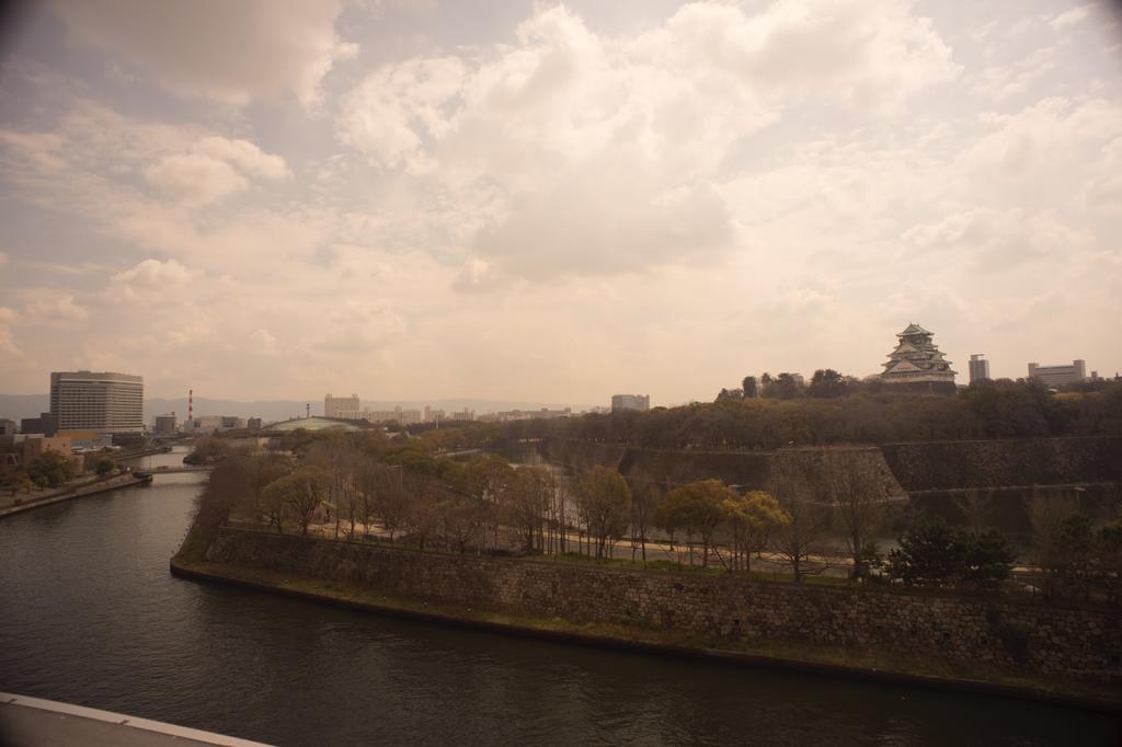
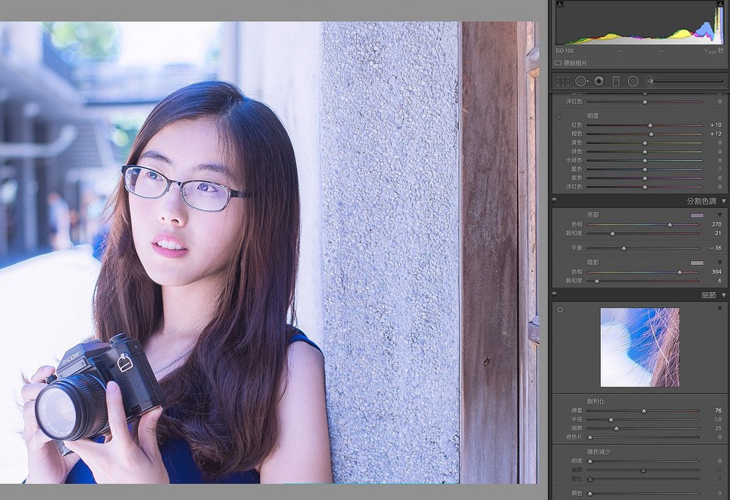
The above image is the result of adding yellow to the brighter areas, and blue to the darker areas. Since the skin is one of the darker areas of the photo, while the ground and the sky are brighter ones, the skin appears bluer in the result.

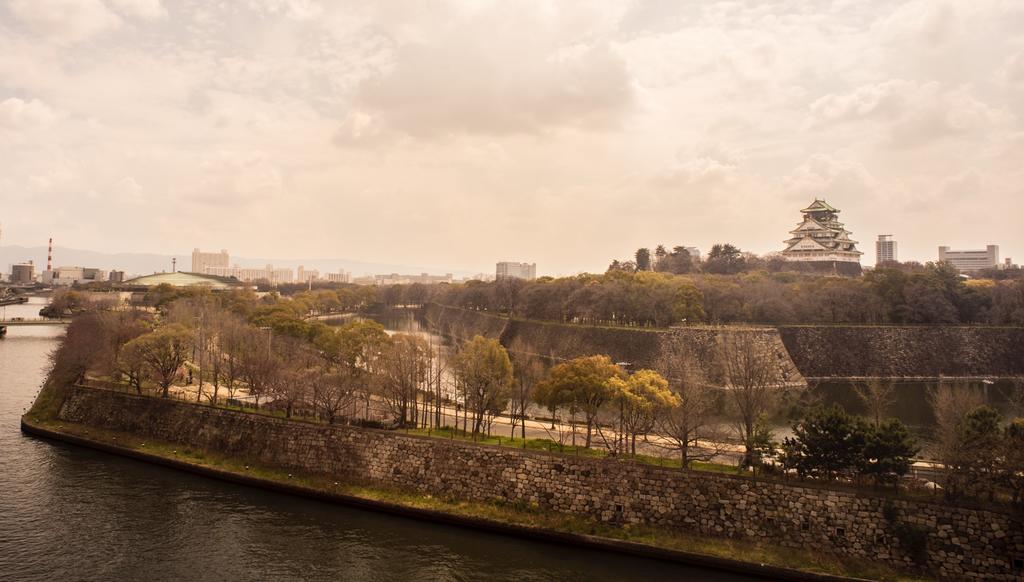
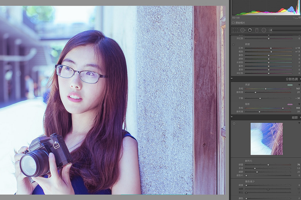
The image below is the opposite of that effect, by adding a layer of yellow onto the darker parts and the skin, while adding a layer of blue onto the buildings in the back. The result is that the face retains a very flesh-like colour, while the background becomes layered with a blue tint.


You can adjust the saturation and hue to decide the overall tint of the photo. Let’s zoom in on the photo and showcase a few examples!


People who enjoy being a little romantic but not too extra can add a layer of blue on the highlights, and a layer of purple on the shadows. The scene will retain a light feeling, but with a soft, pink hue. A simple adjustment for you to get a romantic atmosphere, effective and subtle. 


But if you’re not just interested in being a bit romantic, but instead can’t help but be very extra… then go ahead and drag “saturation” to the right!

The colour will become more saturated when you do this, therefore heavily imbuing the photo with a strong, atmospheric look. This is something very suitable for wedding or dating photos, as it can give off a sweet and loving vibe. 


If you’re the more logical type, and like photos with colder colours, but not “too cold”, then adding a bit of green onto your photo can completely change the tone to a “contemplative” one.

This method of editing is very simple and fast, but once you’ve mastered it, you will be able to handle everything from the feel of the on-location weather to detailed, heartfelt emotions.


Basic colour adjustments are incredibly simple, right? I will never lie to you, editing dreamy photos is not difficult at all.


If you are interested in our articles, you can also LIKE our page:)

Want to see more related articles? CLICK ME to enter the Chinese version website.

Make those bold edits! And witness the miraculous God rays


“Lightroom truly is an amazing editing tool that can turn something completely unremarkable into a piece of gem. A lot of unsuccessful photos can be easily brought back to life just by applying a few filters. This article will teach everyone how to use the gradient filter function to turn an ordinary photo into one that is unique and stunning.”


Sometimes we’d finally get the chance to travel abroad, but due to various reasons such as temporary misjudgment, a lack of skill, poor lighting or a shortage of time… we end up with a series of boring and uninspiring photos. But your friends insist on you showing them your travel photos, so what should you do? Previously I’ve discussed a photo shot in Sweden, where I’ve edited it from a dark, backlit photo into a vacation photo masterpiece. Though that picture was, after all, based off what was realistically present. Today, we are going to be fierce, and come up with an edit that is “oh wow dope”, how can we approach that?

At times like this, adding some fancy god rays may be a good idea!

What are god rays?

The so-called god rays are rays of light that radiate from the sky onto your subject, but please don’t mistake it with “a ray of light that shines from the top of your head into the sky”. God rays always come down from the sky, not the other way around, so when we create the effect, it has to come from the sky. But I still must remind you, god rays are not necessary to fake effects for photos, as long as there are some clouds in the sky, any gaps that result in between the clouds will have god rays shooting out from it.

So god rays are actually rather commonplace, just hard to capture on camera. But we have Lightroom! So what can’t we do?

First, let’s look at this picture!

Honestly, I don’t even know why there is such a lame photo in my Lightroom library… this photo is even worse than what I would shoot with an iPhone, not to mention that the colours are weird, the sky is foggy, with severe vignetting also present. A photo like this is not very convincing for your case when telling people that you’ve been to Osaka. So we must give this picture a nice polish!

First let’s crop out everything that doesn’t belong there, such as the vignette and the buildings near the edge, and slightly adjust the composition. I’ve left the Osaka castle small here so that when the god rays shine in its presence will be emphasised, it is, therefore, unnecessary for it to be enlarged.

Next, we’ll fix the highlights and shadows, we’ll be using the defogging method here: decrease the highlights and the shadows. Although Lightroom also has a built-in function to get rid of the fog in photos, I’m still used to manual adjustment. I therefore directly increase the exposure of the image and decrease the value of the highlights and shadows, that way, the problem of fogginess can be solved. Additionally, another defogging method is used here: increasing the clarity, allowing the photo to look more sharp and clear.

Another reminder here that clarity and sharpness are not related. If you want to increase the details of a photo, so that the scene looks sharp, please make adjustments to the sharpness instead of clarity.

As the colour of the photo is already lame, plus I’m not sure if something got stuck that day, the colours of the photo just cannot be tweaked to look normal. Therefore, I might as well edit the photo to an old and sepia tone, I’m already trying to add an unrealistic god ray anyway, why not just edit the photo into the style of a disaster film.

Now comes the focus of today, the god rays! Most online tutorials teach people how to create them in Photoshop, but we don’t need it to be so complicated here. Since the only subject that will be given a spotlight today with the rays is the Osaka castle, we only have to use gradient filters. First drag a filter from the bottom left corner to the top, placing the front edge of the filter to the left side of the fake ray, and trace out the line of the ray.

Then decrease the area covered by the filter, lower the highlights and increase the clarity to make the photo looks more dramatic.

After the left side is complete, all that is left is the right! Drag a gradient filter from the top right, and trace the line of the ray.

Do the same thing and lower the exposure, highlights while increasing the clarity of the filter, so that the clouds on the right half becomes equally dramatic. And now you can see a decent looking god ray shining upon the Osaka Castle! Take special note of the origins of the light here, since god rays usually come through gaps in the cloud, your ray has to radiate from in between the clouds. You can’t have the origin of the light set on a cloud, it will look very awkward as if there is a glowing cloud in the sky.

Therefore in the case of this photo, I have the light shine through the edge of the extra large piece of cloud, so that there is a feeling of the ray breaking through the sky.

Lastly, adjust the contrast and clarity of the whole photo as well as making detailed modifications to the brightness, position and linear qualities of the god ray. And you too can create a dashing, movie poster like the photo!

If you are interested in our articles, you can also LIKE our page:)

Want to see more related articles? CLICK ME to enter the Chinese version website.

Understanding these will allow you to easily play with filters

“Professional post production can be as complicated as it gets, but just by acquiring the basic knowledge of the different attributes, you can also easily salvage mis-shot images, and even develop your own unique visual style. This article will explain the purpose and relationships of the four attributes ‘exposure, contrast, tint and temp’, and how to adjust them using Lightroom.”

Continue reading “Understanding these will allow you to easily play with filters”