What is RAW? Post-production of amazing pictures relies on it!


“What is RAW? I believe that people who are in the industry of retouching photos are really familiar with it. This article will be using Tony Northrup’s tutorial, to let everyone more understand why RAW is so useful during the post production~ “


We always heard that shooting in RAW is better, where more details can be recorded, and the range of post-production is also wider. But how big is the difference between RAW and JPG? From Tony Northrup’s tutorial, it has shown that the difference between both, which is worth as a reference!


As a conclusion for the tutorial, the pros or RAW are:

Larger motion range (01:20) (03:05) (04:05) (04:58) (06:05) (07:35)

Raw files have a larger motion range, there under the circumference of big difference of light source, the details under brighter and dimmer environment can be more recorded. Therefore using some techniques in post-production, the details under overexposed and underexposed can be shown.

White balance is adjustable freely (02.15)

If you are using JPEG format to shoot, the white balance is determined by the camera, which is difficult to retouch at the post-production session, and even it is retouched there might be damage to the image quality. In comparison, using RAW format to shoot, the white balance can be freely adjusted during the post-production without damaging the quality if the image.

There is also stated the cons of using RAW format, that is the file size is relatively large. and the most significant cons is during time-lapse shooting. The normal RAW file usually takes more than 10MB. If you are using the RAW format as time-lapse picture format, you would not able to shoot too much, due to the disability of camera to process such a number of the RAW file at the same time. Therefore at this time, JPEG format shooting might be a better choice.

Besides that, I believe that everyone noticed that the RAW file is highly relatable with post-production. if your photography habits do not often require a lot of post-production, shooting files is less, then storing and sharing JPEG might be more convenient and a better choice.

via Petapixel


Follow 我们的Page,每天追踪科技新闻!

想看更多英文版文章吗? 点我进去~

The new “Music Sticker” that Facebook has allows you to watch and listen more vividly


“Facebook is going to have new service content! Facebook is expected to work with music content providers to provide new music content. Facebook hopes to make song content more exposed and play listening opportunities through its own platform services.”


The “Music Sticker” function, which was tested for specific users in September this year, has been officially opened to the public, allowing users to add music content to their personal limited time dynamics, photos or video content so that the video content can become More lively.


The music content will be provided by Facebook, users can use it all, or specify the clip to add photos, videos, or personal limited time dynamics.

After adding music content, the name of the music track and the author will be marked in the uploaded photos, videos, etc., and the user can further adjust the position of the music-related content or add more visual effects so that the image content can become more active.


In addition, this update also includes the ability to add music content to the profile introduction, allowing users to add music, songs that represent their own style, and even further link the album cover of the music content, as well as the corresponding singer photos.

Not surprisingly, this feature should also involve Facebook and music content providers in cooperation, and it is expected that the song content will have more exposure and play listening opportunities through the Facebook platform service.

The previously launched Lip Sync Live live K song function, in this update also officially joined the synchronous display lyrics function, allowing users to avoid forgetting words in the live broadcast process.

Mash-Digi  [reference source]

If you are interested in our articles, you can also LIKE our page:)

Want to see more related articles? CLICK ME to enter the Chinese version website.

How to charge your phone to maximize it’s battery life?


“There are different kind of version about how to charge your phone, but how is ti exactly yo charge a phone? This article combines informations from Apple’s official website, battery manufacturer instructions, and experience of the author, and will share three charging methods and battery maintenance to extend battery life for everyone reference~”


Today, I am going to talk about three must know about charging your phone. By following these steps, you will have a longer battery life than the others!

PS: Reference is from Apple’s official website and instruction from battery manufacturer, combing experience of mine. Until now, I had used the first iPad version of 2010, iPhone 4s from 2011, and both still have around 80% of battery life without changing new batteries. I think these steps might be really useful!


1. Lithium batteries have no memory effect, and excessive discharge will accelerate the life cycle.

PS: Figure above shows a nickel-metal hydride battery with a low battery memory effect.

According to my experience, “using all the battery before charging your phone” can be said as the first wrong concept. Why will people have this wrong concept? In fact, “battery has memory, charging it before using all up will destroy it”, this is for nickel-cadmium rechargeable battery牧 which is the old fashion rechargeable battery that we used (as the above figure is AA rechargeable battery ). This battery only can be charged when the battery is used up, or the rechargeable amount of energy will be lesser and lesser.

However, smartphones, tablets, laptops, digital cameras, power banks and other product nowadays normally use “lithium battery”. This kind of battery has exactly different properties with the nickel-cadmium battery. The difference is that lithium battery does not have memory, and cannot discharge too much of stored energy. Normally, lithium battery’s life is calculated by “cycle count”, which is the count of charging from (0~100%). In simple, if one lithium battery has a 1000 cycle count of lifespan, in general, it can be charged for 1000 times from 0% to 100%. But in fact, excessive discharged of power will cause damage to the battery due to physical problems. Hence, if you use until 0% to charge, then no matter how many count of cycle count you have for your battery, it might be malfunction more easily.

Therefore, the first rule of using a lithium battery is to charge the battery only when it is used up but to charge it whenever you can. This will lengthen the lifespan of your battery! However, if you normally couldn’t charge it at any time of the day, letting it use up to 0% to charge, it is better for you to buy a power bank. Do not use until its minimum power then charge!


2. You can still plug it on charge when it is full, it’s okay to unplug it before you leave

The second misunderstood concept is that “you must unplug the battery once it is 100%”. I don’t really know how is this happen, but we don’t really need to know how this has spread among all of us tho. In fact, there is an anti-overcharge system no matter in smartphones or laptop. When the battery is fully charged, it will automatically cut off the charging and use the power directly. For example, from the figure above, it can be seen that when the laptop is 100%, MacBook Pro will automatically cut off the charging and turn it into the power adapter, which will maintain until the battery percentage is below 95%. Or please pay attention to the plug icon when the battery is fully charged in iOS6 (if you still have it).

Therefore, there are no worries to not unplug it directly when the battery is fully charged. There might be people wondering “Is it really okay to leave it on the plug?”, about this point…… unless you leave your phone charging for a week, or else please do trust the manufacturer about the anti overcharge system, don’t make yourself crazy thinking about all these!


3. Letting your phone to be less than 40% once every two weeks to maintain the health of the battery

If you had used to all the above steps of charging after reading this article, then you are moving further forward to “longer the lifespan of your battery”! But here, you might need to do one more step, that is once every two weeks, let your phone to be less than 40% to lengthen the lifespan of your battery. At first, we must know that lithium battery is a very picky battery. Letting it keep discharge power will shorten its lifespan, letting it discharge until 0% will also shorten its lifespan, or even not letting it discharge even also will shorten its lifespan!

Due to the physical specification of the lithium battery, which makes if it does not discharge to activate it for a long time, it may shorten its lifespan. But if you continue letting it discharge, it will also shorten its lifespan. Therefore to solve the problem, the best way is to use up the battery below 40% twice a week, (it is okay to use till 30%, but not 0%), and then charge it, hence to maintain the battery health and longer its lifespan! Of course, this is for those who don’t unplug it always, if you always use up the battery power of your electric appliance, then you can ignore this step!

As for the extent to defend whether is the battery “dead”? In fact, two simple steps can be made clear. The first is that the lithium battery will expand as shown above after it dies. Please note that this is not an explosion. This is just a mechanism to remind you that the battery has broken. If your iPhone or other devices suddenly “get fat”, please change the battery! Second, if the battery doesn’t get fat, but your phone obviously has less power stored than before, and you are quite sure that this isn’t caused by background app activating, you are advised to hurry to send it for repair!

If you are interested in our articles, you can also LIKE our page:)

Want to see more related articles? CLICK ME to enter the Chinese version website.

Here comes the simplified Facebook Messenger! A new dark mode is added!


“Facebook has announced that a new version of Facebook Messenger is coming! This time the highlight will probably be the whole new dark mode that has added to Messenger with a black background. Let’s take a look for it.”


Facebook announced earlier that the Messenger interface will be simplified, which will reorganize the original page into chat, people and discover, and add a dark mode with a black background.


In this version 4.0 update, Facebook did not remove any Messenger features, so the most important is to simplify the integration of the original paging options, making it easier for users to find contacts or related content, and add more to the chat interface. Multiple interactive features, such as adding voting options to group chats, or sharing map locations.

In the chat conversation, the customizable colour is also added, and the speech bubble option with gradient colour effect and the dark mode is added according to the trend so that the user can watch the chat conversation content more comfortably and avoid watching the white for a long time. The operational interface of the background causes eye strain.

The new version of the chat interface is expected to be released in the coming weeks, which will be used for iOS and Android platforms respectively.


If you are interested in our articles, you can also LIKE our page:)

Want to see more related articles? CLICK ME to enter the Chinese version website.

Collections from Sony’s 70th Anniversary


“Every 10th anniversary represents a milestone, and the world renowned company Sony is now celebrating their 70th year. Whether it is mobile phones, household electronics or entertainment… Sony has had an excellent record, making its industry giant status well earned. This article is dedicated to the 70th-anniversary exhibition event held by Sony a while back, allowing fellow Sony fans to recollect memories of these classic products.”


The famed brand Sony has already become an international trademark by 2016, with many of its products reaching extensively into every facet of society, and whether it concerns mobile devices, television, photography or entertainment media, Sony has been undoubtedly successful. For an industry titan such as this, do you know that Sony has already existed for 70 years?


Since Sony’s founding in 1946, seven decades have passed in the blink of an eye, it has even reached the fifty-year mark since its establishment in Taiwan. During this time, Sony produced a myriad of classic products, including the first coloured television, the first transistor radio, the first Walkman portable media player, the PlayStation that replaced Nintendo’s 2nd generation game console and the AIBO robotic pets that pioneered AI products, all of these are well-remembered classics that have a nostalgic place in customers’ hearts.

▲ “70” is the key symbol for this event.

▲ The entrance of this exhibit displayed various important events over the years, including the visit by Michael Jackson.


In order to celebrate its 70th anniversary, Sony specifically set up an exhibition in Huashan Creative Park, gathering up all its classic products in the exhibition area for visitors to appreciate. Older visitors can also re-experience some nostalgic memories of using some of these products back in the days, while younger visitors may come to understand through this exhibit, how Sony was able to cultivate their record by discovering the fantastic history of the company.

Pic: The origin of the name Sony
The company was originally called “Tokyo Tsushin Kogyo”, but as the country began to embrace the international market, a new name for the company was decided when considering internationalisation.
The thought back then was to create a name with a simple phonetic pronunciation that will allow it to be easily identified and pronounced in any country in the world.
The then founders Mr Ibuka Masaru and Mr Morita Akio took the Latin word “Sonus(sound)” and the English word “Sonny” or “Sonny-boy” and derived the name “Sonny”, its meaning being “a cute and playful child with strong relation to sound”.
However, the spelling “Sonny” resembles too much the Japanese term “sonn-ni” which means losing money, making it too negative. Therefore, one of the “n” was removed, and the Japanese styled English word “Sony” became the official name of the company.

▲Are you aware of the origin of the name Sony? You will, after this exhibition.

▲The evolution of Sony’s logo, can you tell the difference of the later versions?

The products displayed in the event hall are bound to elicit some reactions from visitors! There are likely some products there that you’ve used in the past yourself. Below I will introduce a few of the, especially iconic ones.

▲Look at this vintage scene below, does it remind you of the days where you played with your Nintendo on a CRT tv back in grandma’s house? The adverts and posters of the wall were all the most popular models back then!

▲This Sony doll might have even appeared in your childhood living room!

▲Back then, Sony was sponsored by Shinli, so it’s also called “Shinli brand”. I never understood then what relationship the name Sony has with Shinli, I only knew that this company makes good TVs.

▲A lot of electronic stores back then have garage doors like this!

▲This is the first full-colour television Sony came out with! Trinitron is Sony’s exclusive tv technology.

▲The above TR-55 is Japan’s first transistor radio, Sony greatly reduced the size of radios, making it a portable device.

▲Speaking of the Walkman, we’ve gotta give Sony the credit. The word Walkman was popularised by Sony’s TPS-L2 released in 1979, the direct connotation of the word being “listen while you walk”, it can be said to be a revolutionary product in the music industry.

▲ Sony’s MD can be said to be many young people’s dream product back in the days. The model seen above is the MZ-1 released in 1992, although the MD models didn’t end up becoming popular then, it has since then become a collector’s dream.

▲The TV5-303 mini television that came out in 1960 made televisions not just strictly a household applicant, but something you can take with you as you go.

▲The first tape recorder TC-10 released in 1966 by Sony, it must have accompanied many people through their early student life.

▲Sony remains popular among professionals in the video camera industry. The above CCD-V8 released in 1985 is the first 8mm video camera by Sony, it accomplished the goal of having high-quality visuals while being light in weight.

▲The first generation PlayStation counsel! Need I explain more? This grey-white thing is what dethroned Nintendo as the top industry player.

▲When mobile phones were first popularised, Sony released related products too. The shuttle knob of this phone is one of its key characteristics. (the above model is the CMD-J16)

▲Different from the J16 shown above, this flip phone is the Z18, it is also a classic model.

▲The portable cassette recorder is also one of the iconic music players back then! It does both voice recording and music recording and is also one of the essential equipment of young people in Walker’s paradise back then in Japan.

If you are interested in our articles, you can also LIKE our page:)

Want to see more related articles? CLICK ME to enter the Chinese version website.

How simple is it to edit colours? Let a girl’s dreamy palette tell you


“Sometimes when you see beautiful pictures online or in magazines, you must feel that its effect is only achieved through a complex series of edits. But actually, editing ain’t so hard, by simply tweaking the tint of a photo, you can completely change its style. This article is here to teach you how to quickly find your own dreamy look palette.”


What will be shared today are tips to adjust the tint of a photo in one click! Most wedding photos with the dreamy edit are done using this method.

Aside from this, the dreamy tint you see in some short films, MVs or commercials that look unrealistic yet beautiful… are more or less all edited through adjusting the tint.

A photo like this, if shot using a phone, can be edited with these effects using built-in filters. But if you don’t like the options given by the filters, and want to find your own style, then as long as you understand tone splitting, you will be able to perform magic on your own photos!


The above is a portrait I shot, when unedited, the colours just look natural and light, without any special style or atmosphere. After loading the photo in Lightroom, find “split toning” in the right-hand column, adjust the values, and observe the magic!


Split toning is divided into highlights and shadows, affecting the brighter and darker bits of the photos respectively. And according to your commands, it will change the tint!

The above image is the result of adding yellow to the brighter areas, and blue to the darker areas. Since the skin is one of the darker areas of the photo, while the ground and the sky are brighter ones, the skin appears bluer in the result.

The image below is the opposite of that effect, by adding a layer of yellow onto the darker parts and the skin, while adding a layer of blue onto the buildings in the back. The result is that the face retains a very flesh-like colour, while the background becomes layered with a blue tint.


You can adjust the saturation and hue to decide the overall tint of the photo. Let’s zoom in on the photo and showcase a few examples!


People who enjoy being a little romantic but not too extra can add a layer of blue on the highlights, and a layer of purple on the shadows. The scene will retain a light feeling, but with a soft, pink hue. A simple adjustment for you to get a romantic atmosphere, effective and subtle. 


But if you’re not just interested in being a bit romantic, but instead can’t help but be very extra… then go ahead and drag “saturation” to the right!

The colour will become more saturated when you do this, therefore heavily imbuing the photo with a strong, atmospheric look. This is something very suitable for wedding or dating photos, as it can give off a sweet and loving vibe. 


If you’re the more logical type, and like photos with colder colours, but not “too cold”, then adding a bit of green onto your photo can completely change the tone to a “contemplative” one.

This method of editing is very simple and fast, but once you’ve mastered it, you will be able to handle everything from the feel of the on-location weather to detailed, heartfelt emotions.


Basic colour adjustments are incredibly simple, right? I will never lie to you, editing dreamy photos is not difficult at all.


If you are interested in our articles, you can also LIKE our page:)

Want to see more related articles? CLICK ME to enter the Chinese version website.

AI evolves! It can do IQ exams now!


“Does everyone still remember the news back in 2016 when AlphaGo beat the Go world champion Lee Sedol? It’s been more than two years since then, and AlphaGo has gone through even more advancements and trials including being surpassed by the AlphaGo Zero. AlphaGo’s success can be attributed to its development team DeepMind’s continuous training and improvements, today, DeepMind’s team have even started training AlphaGo to use abstract thinking in order to simulate a human’s deductive pattern. Their goal is to break the current limitations and confines of AI and deep learning, creating machine intelligence that is more and more similar to human cognition. Let us take a look at the plans of the DeepMind team!”


AlphaGo’s development team DeepMind have already started training artificial intelligence systems in the concept of “abstract thinking”, in hopes that future AI systems will be able to perform deductive thinking like a real person in order to answer questions. (Source)

After training its AI systems through playing games, researchers from DeepMind are also planning to let its AI challenge an IQ exam.
According to a publication in New Scientist, the London based Google DeepMind team trains its AI systems with IQ exams, allowing it to develop abstract “thinking” skills.

The training method the DeepMind team uses is based on Raven’s Progressive Matrices devised by British psychologist John Raven in 1936. By using question sets of progressive matrices from simple to complex, the AI system’s “intelligence” can be determined as its “observation” and “abstract reasoning” skills are evaluated.

As the questions in Raven’s Progressive Matrices are more than just shape matching, solving the questions will require the test taker to exercise abstract reasoning. Furthermore, a version of Coloured Progressive Matrices was even later designed for children, in addition to a version of Advanced Progressive Matrices that are targeted at people of above-average intelligence. With different versions of the test questions made for measuring the intelligence of test takers from age 5 to 75, this form of IQ exam became one of the most common methods to measure intelligence.

As explained by the DeepMind team, by using IQ tests to train AI, the goal is not to create a system that can answer these test questions, but to create an AI that can come close to simulating human thinking patterns, combining existing information with logical reasoning and abstract thinking to find answers, and even make judgments based on reflexes like a real human brain.

If you are interested in our articles, you can also LIKE our page:)

Want to see more related articles? CLICK ME to enter the Chinese version website.

Follow me step by step to become a fascinating transformation photo master!


“Do you often find yourself shooting pictures that are either too bright or too dark? Or that even after doing research online on different shooting techniques, you still find that your photos never come out as impactful as you want it to be? Through editing, you will be able to achieve deeds as small as correcting the brightness of an image, or something as big as completely altering an image’s style. Although some photographers insist on retaining the original look and feel of a photo, image post-processing is actually something of great enjoyment value and also requires a lot of skill. This article will lead you to step by step through easy and useful tricks that you can apply to image editing.”


What I’ll be showing you today is the easiest and most basic example of image editing. In the future, I will also be using examples to demonstrate different shooting techniques and editing methods, and I hope that everyone will be able to learn something to apply to their own photos!

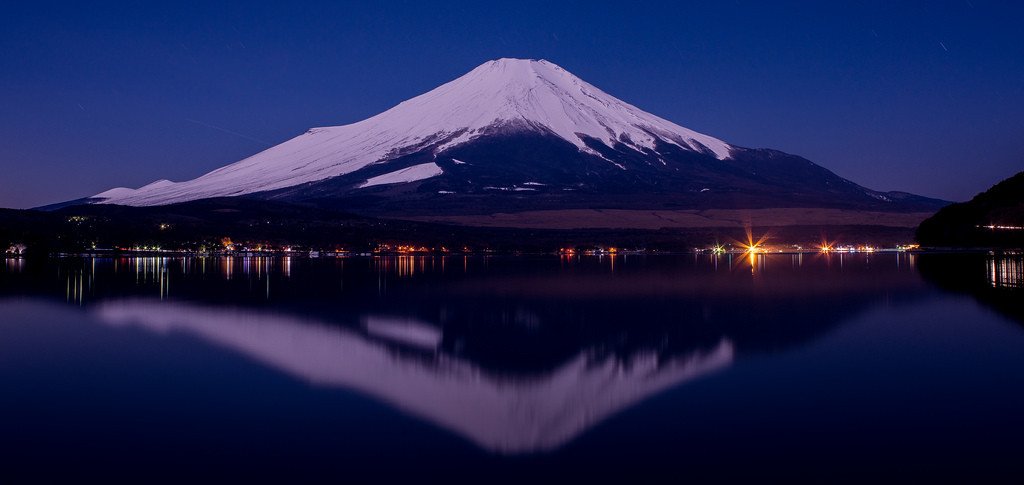
This photo is the result of me standing in the cold, at night, beside a mountain lake shooting with a tripod and a shutter release. It is a long exposure photo with an exposure time of 104 seconds.


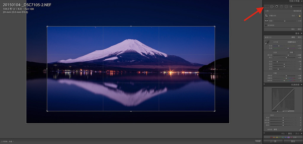
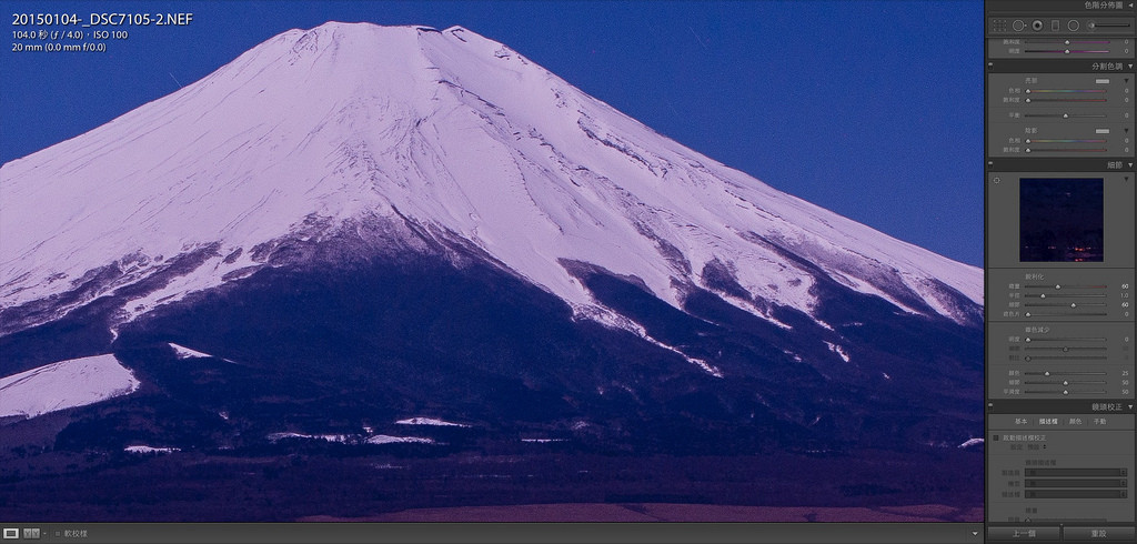
However, the wind that night was actually quite strong, therefore in order to prevent the waves on the lake from destroying the reflection of Mt. Fuji, the exposure time could not be extended anymore in order to get a photo with adequate exposure. Therefore the actual RAW file of what I shot actually looks like this, as shown below:


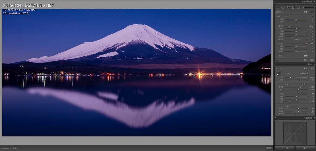
You must be thinking: That is way too big of a difference! Indeed, as I have mentioned in another photography lesson a while back, if you shoot in the RAW format with a DSLR, you get the maximum amount of editing potential afterwards. Even though the above picture was exposed for 104 seconds, it is still impossible to get a shot of the lightless Fuji mountain that is “bright enough” under ISO100. Even the colour contrast looks rather flat and two dimensional without any processing. In the following section, I will be editing this photo following the steps that I usually take, with the final result being the cover photo you just saw.


1. Adjust the exposure


Before editing begins, I always make sure I adjust the exposure of the image so the brightness reaches a level where it is “clearly visible to the naked eye”. Because whether it is the contrast or colour that you are adjusting, we won’t be able to assess clearly what we are editing when the photo is not bright enough. Therefore making sure that the photo is made to be “bright enough” is a must.

Generally speaking, I will make the photo just a little bit brighter than the brightness that “looks bright enough” (usually it’s around +0.5~1EV), this is because when we’re going to adjust the contrast, highlights or shadows later it’ll usually make the photo a bit darker. So I what I usually do is to adjust the photo so that it is slightly overexposed, to begin with, this way, I won’t have to come back and re-adjust it later.


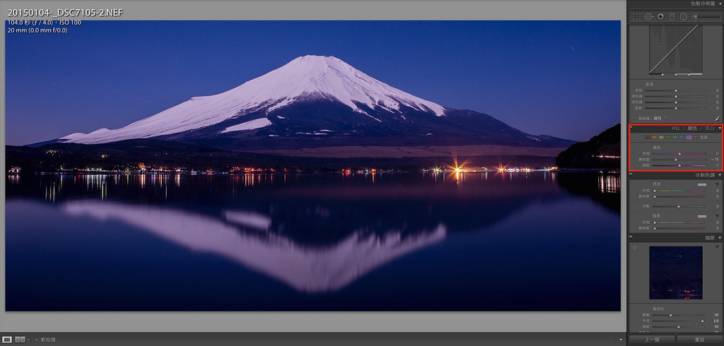
2. Adjust contrast, highlights & shadows, clarity, vibrancy


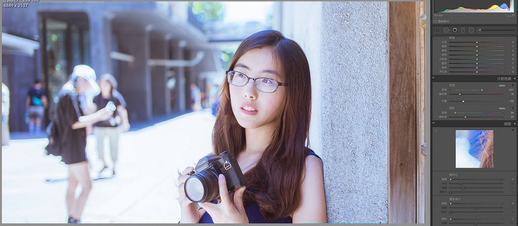
After adjusting the exposure, you will find that the photo will become flat and dull, this is because Lightroom increases a photo’s overall brightness evenly, which makes the already two dimensional photo look “even flatter”, this problem can be corrected by adjusting the values in the red box indicated in the above image.

First let us adjust the levels of the highlights and shadows, generally speaking, I start by dragging it towards negative values. However every picture will have a different combination of values, so refer to your own work when trying this out. The image will look more layered and three dimensional after adjusting the highlights and shadows, but this is not enough!


RAW files only record the data of an image and do not apply any additional edits to it, the colours of these files are therefore generally duller and less sharp. This is where we will be using the clarity, vibrancy and saturation tool to enhance a photo’s vibrancy and sharpness. Here it is also recommended to tweak the values of these three settings based on your own photo. For portraits, I generally think that a clarity of +5 is enough and can prevent the human face from looking too rigid, but anything other than portraits I’d adjust the setting to at least +20. Beware, however, if you increase the clarity by too much the contrast will also become too high, so adjust the values accordingly and don’t set extreme values. As for the vibrancy and saturation, try it out yourself and adjust according to your colouring needs!


3. Crop the photo, correct the horizon


As there used to be a certain set of ratios when printing photos in the past, we will usually shrink or zoom our photos to specific sizes (such as 4X6, 5X7). But since we all look at pictures on computers or phones now, if you think your picture would look better if it is “long and thin” then go ahead and crop it the way you like! It is your work, don’t mind so much what other people think, the most important thing is that you like it!

As for this photo, since it was shot from the beginning with a 20mm ultra wide angle lens. A large portion of the frame will be occupied by the sky and ground with a lot of random noise in it, I am therefore only interested in keeping the part with the mountain and its reflection. So I crop the photo until it has a flatter ratio, and not only does it look good, it also makes it suitable for printing longer posters.


You must remember to correct the horizon!

You must remember to correct the horizon!

You must remember to correct the horizon!

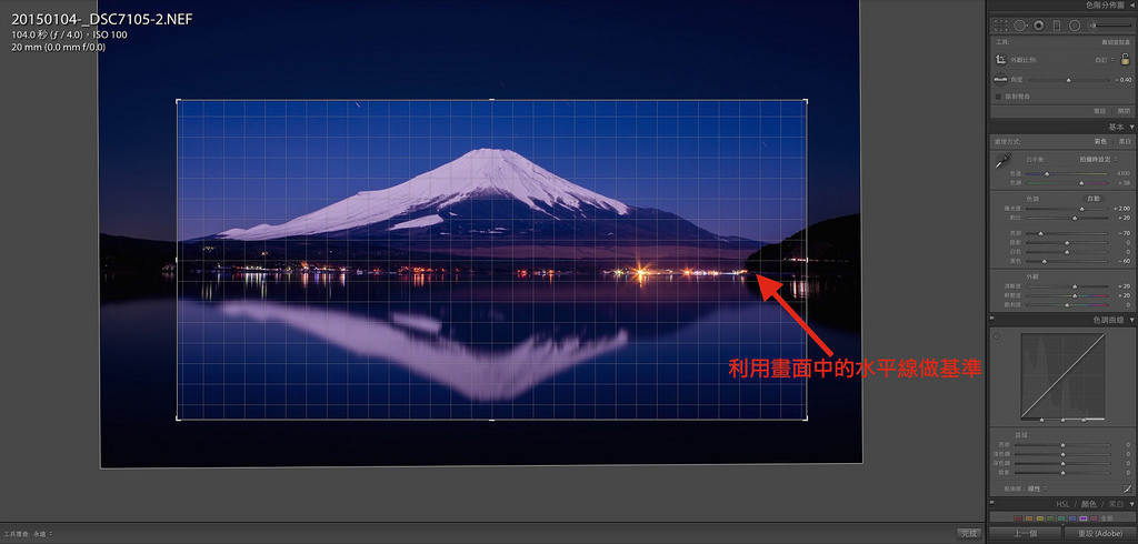
Important things should be repeated three times. You might not have captured a perfect horizon while shooting with your hands or with a tripod, and that is not so much of an issue. The problem is that many people don’t even bother to correct the horizon afterwards when they shoot scenery photos, and this really does make people uncomfortable!! I, therefore, make sure to correct the horizon of every photo I take to prevent “making myself uncomfortable”. It is easy to correct the horizon as well, just move the cursor to the corner where it turns into a rotation tool when you’re using the cropping tool. While you’re rotating the image guidelines will appear for your reference, and all you have to do is adjust the photo so the horizontal and vertical items in the shot are matched up with the guidelines.

The example above uses the lake as the reference point for adjustment, making it very easy to correct the horizon.


4. Use the gradient filter to make adjustments, emphasise the photo’s theme

As this photo was taken during a full moon, the Fuji mountain itself and its reflection are of a similar brightness. But since our theme today is the mountain, its reflection is really only there to serve as a contrast. If the reflection is too bright it will make the mountain stand out less, therefore we must make slight adjustments to the reflection in order to emphasise our main theme.


And we’ll be using the gradient filter to adjust the brightness of the reflection! I drag the filter from bottom to top, and slightly lower the brightness of the reflection of the mountain so that there is a larger contrast between the mountain and its reflection, pushing the main subject Mt. Fuji to the front. Furthermore, due to a part of the reflection being blurry, we can also use the gradient filter to increase the clarity of the reflection (clarity +100), this way the shape of the reflection can be emphasised.

As for why we should use the gradient filter to decrease the brightness of the reflection and not increase the brightness of the mountain? This is because if you overly rely on Lightroom’s brightness tool to increase the brightness of a photo, it pretty much does the same thing as when you increase the ISO value in the beginning. Both results in a lot of noise on the photo, decreasing its overall quality and appeal. Therefore I usually directly use the gradient filter to decrease the brightness and increase contrast after determining the photo’s overall brightness, this is more or less a compensation that is made to prevent noise.


5. Adjust sharpness, make Mt. Fuji look more clear


After adjusting the light and shadows, we can go ahead and work on making the photo more sharp and clear! Since RAW files don’t get sharpened automatically by the camera, the resulting photos usually look a little more blurry. In this case, we can use the “detail” panel below and edit the photo so it becomes sharper, this way your photo will be able to look like a poster or scenery shots in magazines! This step is very important, as it is the vital step in determining whether your photo is “sharp” and processed properly. However when you try to adjust this setting from the start you could easily misjudge the value of the sharpness due to issues with highlights and shadows, I therefore usually save this step for last.


6. Adjust the hue, colour temperature and make corrections to specific colours


Generally speaking after making a bunch of adjustments to a photo, its colour will start straying towards a “weird” direction. For instance, this photo after going through the above-demonstrated adjustments, it went from being a “blue” photo (Mt. Fuji at night is blue) to be a purplish redone. This is when we will be using hue, colour temperature and local colour correction to correct the colour of an image. Or else you’ll be left with having to upload a purplish-red image of the Mt. Fuji with a caption saying that it is shot during the night. Although it is not wrong, this would be considered more of an artistic rendering rather than a realistic one. So adjust the values according to your personal preferences!


Now we’re all done!

This concludes the post-processing work of this image of Mt. Fuji at night. Don’t you think when compared to the original version this newly edited one looks a lot more dreamy? I know that many people think “editing” strips away the merits of photography, and I will ask them this: do you still call it photography then, if you use a specific brand of camera to capture a specific soft skin tone on people?

We can easily capture images with colours catered to our needs by selecting specific camera brands and utilising the characteristics of its lenses. Although during the age of film back then we could also select films and particular lenses in order to obtain a “specific” colour performance, speaking of post-processing, layering and such still would require you to rely on darkroom editing. Back then, we don’t have cameras that directly produce JPGs (aside from polaroids). Therefore personally, I always shoot in RAW when I take pictures, whether it is for travelling or self-portraits. I do use both Nikon and Sony cameras at the same time after all, so if I rely only on the cameras to do the work, then not only will the resulting colours on my photos not fit my need, there might also be visible differences between results from the different cameras. Why then would I rely on the cameras themselves to render my images?

If after you’ve read this article you still don’t catch the differences between each step of my edit demo, then there may be two possibilities: One is that your monitor is of low quality can can’t distinguish between detailed colour differences; the second is that you may be less sensitive to colours yourself, something which can be improved through training.

If you are interested in our articles, you can also LIKE our page:)

Want to see more related articles? CLICK ME to enter the Chinese version website

Try this to make your camera pan and dolly without any professional equipment!


“Technology nowadays has made our life become more and more useful, the film that made by cellphones is getting more and more professional. Try this film making DIY tools to make your film making more convenience!”


Shooting the film wants a smooth mirror and no professional equipment. In fact, the roller knife used to cut the pizza can be used. When you just use a small range of mobile phones, just attach the phone to the handlebar and move the lens horizontally.

First prepare the materials as follows: rubber bands + clean pizza cutter

Wrapped around, you can get out of the good results

Change direction has different effects


If you are interested in our articles, you can also LIKE our page:)

Want to see more related articles? CLICK ME to enter the Chinese version website.